 0:01 a Muse Entertainment/
Back Alley Films
production
0:08 created by Laurie Finstad Knizhnik
Janis Lundman

0:16 Héléne Joy
Sonya Salomaa
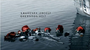
0:25 Laurence Leboeuf
Greyston Holt
0:28 and Justin Louis
 0:35 Durham County
The connotations in the opening typography are very depressing and tense. The font is basic, but smart. Colours only black and white, contrasting the background colour which is only black or white too. The positioning of the texts is presented on the background of the opposite colour; black or white. The static positioning of text maintains the unnerving nature of the sequence.
From this clip's title sequence I have learnt of the importance of the way in which typography is presented. The font in this sequence is very basic but the way in which it is shown is very effective.
I have learnt about the importance of the background in title sequences as well, as the colours in them are in fact more significant than what is actually happening in them. They tell the story without context and dialogue which is very important. They connote a meaningful and saddened tone to the production; certainly not an upbeat comedy or reality show, this is a drama.
We can clearly use this research in our film. The simple font is very significant for us. The positioning of titles is also very important for our film, as the text will not be presented on a black background but instead integrated into the background setting.
TH
No comments:
Post a Comment